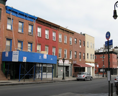
 290 Smith Street
Matching the cornice and window color
to that of the scaffolding is never a good idea.
This particular shade of blue is just a tad too bright, don't you think?
Or did they try to match the bus stop sign across the street?


For Home Page, click Pardon Me For Asking


0 comments:
Post a Comment